When I get new devices I tend to make notes about them: it’s part of my tinkering approach to research, a way to explore the edges of the adjacent possible. Most of the notes don’t get read by anyone else. This often seems like a bit of a waste so, having had a couple of days of vacation (and thus mostly doing the work I felt like doing rather than the work I had to do) this post is an assemblage of notes about a few of the devices I have acquired over the past year or so, at least partially to support my thinking on e-readers (though I cover more features of the devices in my notes).
I am very interested in e-reading because I do a great deal of it, and it is the primary means by which most online learners learn. There’s a fair bit of existing research into e-reading, but the vast majority of it fails to distinguish between desktop PCs, laptop PCs, dedicated e-readers, tablets and cellphones, let alone between different software tools and configurations. This is silly. It’s equivalent to generically comparing e-learning and p-learning which, as we all should now know, is a completely spurious thing to do.‘Tain’t what you do, it’s the way that you do it. It is particularly interesting that, though there are a few variations in paper books – size, font, hard/paperback, etc – the variation is not even close to that found in e-reading hardware and software, and we have barely begun to innovate in this area yet. To do so, it is useful to understand the benefits and weaknesses of existing tools. These notes are part of that process.
The devices I will discuss here are:
- Kindle Voyage (high-end e-reader)
- Sony DPT-S1 (A4-size e-paper e-reader)
- Lenovo Yoga Tab 3 (Android tablet with built-in projector)
- Google Cardboard (generic VR viewer)
- Pebble Time Steel (smartwatch)
- iPad Pro and Apple Pencil (needs no introduction)
Amazon Kindle Voyage
 I got this device because I wanted to know what makes something a top-of-the-line e-reader. The Kindle Voyage, though heavily criticized for its price, had (at the time I got it) pretty much swept the board in comparative reviews, coming top in almost all of them. This is therefore my reference point.
The Kindle Voyage is very small: the (6 inch) page is smaller than the average paperback book, especially the slightly larger formats used mainly for academic books. Whether this is a good or bad thing depends a lot on the book. For text, I find that is good enough but, for diagrams, tables and images, it can be too small.
The monochrome e-ink screen is bright and very clear, with better resolution than many laser printers. It has a non-reflective etching that I have tried in bright sunlight and found to be extremely easy on the eye, with virtually no reflections unless you deliberately angle it at the sun. It is not quite paper, but extremely close to it and, in many ways, is superior to read from: flatness and consistency are mostly a positive thing, albeit that the curve of a paper page provides cues about location in a book and helps one to remember a page’s unique shape. It has very even backlighting that gently glows, and dims according to the level of background lighting – this is great, though I’d like it more if it had the option to tint it with red light – the blue-ish glow is not great last thing at night, when I tend to read the most. Battery life, even when backlit, is very good: the claimed 6 weeks of life assumes only half an hour of reading a day, which is way less than I’d normally do, but that still equates to a good 20 hours between charges in real life which, for something so tiny, is good. It appears to take a couple of hours to fully charge on a typical USB connection.
The device is very thin and very light – it feels much lighter than the average smartphone and far lighter than a small paperback – with a nice rubbery grippable back, and intelligently positioned ‘buttons’ on both sides of the screen, so it works well in either hand. The ‘buttons’ are actually pressure sensitive areas: pressing them gives a reassuring and very gentle haptic buzz when they are squeezed. After only 10-15 minutes of pressing them this can lead to finger cramp, however, so it is good that it is also possible to swipe across or up and down a page, in a manner that is quite familiar to phone and tablet users. There are two smaller back ‘buttons’ above the main page flippers, that are quite hard to reach with one hand. There’s an on/off button on the rear of the device, just out of reach of even my long-ish fingers. This is good – it is hard to turn it off accidentally. The bevel is not huge, but is about the right size to make it easy to hold without touching the screen, about the size of a normal book margin.
Performance is notably better than that of any other e-ink devices I have used, with screen refreshing that is fast and that seldom, and barely perceptibly, flashes (a generic issue with e-ink, that starts to burn in if not zapped occasionally with a reverse image). For reading, I find page turns fast enough not to interrupt my flow of reading at all. Much faster than flipping pages in a p-book although, as my weak eyes mean that I like to have a larger font, I tend to do this more often.
It has a web browser, but it’s awful. Soft buttons for the keyboard and tools are often quite unresponsive. Especially annoying is the lag and difficulty finding the right place to press for punctuation such as the @ symbol and period. Once you move on to pages that need scrolling it is very jerky, with multiple refreshes, and extremely slow responses to things like pinching to zoom, which is distracting to the point of making it virtually unusable for many pages: few are optimized for e-readers. Lack of colour also becomes a serious issue on such pages. That is also a noticeable problem when scrolling through my catalogue of books or the Kindle store (also available directly from the device), because many book covers blur into a grey mass: this is a surprising failure on the part of Amazon who, you might think, ought to be doing its best to sell books to you. If you cannot differentiate between them or even see their titles, there is not a lot of point. I still mostly need to get my books via a tablet, phone or PC. It is at least nice to be able to browse books on archive.org and download them (in the correct format) to the device.
On the subject of the book catalogue, the interface to it is tedious. I have hundreds of books that I like to browse, not simply search for, and it can take several minutes to scroll painstakingly through them. There are options for tagging and cataloguing books but, with a large existing catalogue, this is not a simple option. This is many times worse than even a disorganized pile of books, let alone proper bookshelves. The fact that you can search (and search for text within books) is a notable benefit, but the loss of random browsing is a serious disadvantage.
Whispersync works very well: it’s very easy to pick up on one device what was left off on another. I very much like the ‘free’ 3G connection that works in most countries and that allows books to be downloaded (and purchased) from almost anywhere in the world, without the need for wifi, but I deeply hate the fact that a fair number of my books are limited by DRM to a few devices. As a researcher into such technologies, I have a great many versions of the Kindle app on many devices, so I often hit these limits, then have to work out on which machines to disable reading (is it mac 1, or mac 4 that I am actually using? Very hard to tell). In fact, I deeply hate DRM, period. It is not fiendishly hard to convert and transfer non-DRM’d books from other devices but I find the fact that Amazon insist all should be in its proprietary format or PDF (not a good thing on a 6” screen) to be intensely annoying. Given that DRM is perfectly possible in the otherwise ubiquitous epub format, this is an annoying constraint.
I was encouraged after getting this device to try a subscription to Kindle Unlimited, which gives (as the name implies) Netflix-like access to over a million titles – an all-you-can-eat rental smorgasbord covering a vast array of subjects and genres, all for $10/month, with up to 10 books at any one time. This has been a disappointing investment so far. The overwhelming majority of the books are those that no one in their right mind would bother paying the typical asking price of between 2 and 6 dollars and would certainly not bother borrowing from a library. The majority are self-published, and some are scams that are not even meant to be read – they are just a means to leech a bit of money from Amazon, filled with nonsense. Within the area of science I found a great many books that are anything but scientific, with a preponderance of rubbish folk psychology, ’10 things’ books, and right-of-Hitler religious nutcases trying to disprove evolution and climate change. In fiction, there’s a lot of genre novellas and novels of the fan-fiction variety, most of which seem to be of extremely low quality and imagination. Very disappointing, though I have found a copious catalogue of Kurt Vonnegut books, many of which I have not read, so am happy enough for now. There are certainly some gems to be found but the effort of doing so is great, and none of those that I actually sought out have been there so far. The device does allow you to set up a library account to borrow books from your local library. I have not tried this yet, but find the idea appealing. You can, of course, do this on any device, but the convenience is worth having, especially given the complete lack of network charges.
Is it worth the money? I’d say not. Amazon’s own much cheaper alternative, with a very similar screen, the Paperwhite, is a little thicker, lacks the buzzing buttons and adaptive backlight, and is slightly slower, but these are not big enough differences to be worth $100. My only other notable e-ink device till this point was a tiny and now slightly elderly Kobo with a 4” screen. Apart from size and backlight, there is not too much to choose between them. Yes, the Voyage has a notably better screen, but not so much that it is worth nearly $200 more (the Kobo cost me less than $40) and bigger is certainly better, but not $200 better. The software on the Kobo is, I would say, mostly a bit nicer, but essentially extremely similar. Its native epub format is way friendlier, with far more books available without the need for conversion, albeit with less wonderful sync between devices. The main differentiator is the book stores behind them – Amazon’s catalogue is vastly much bigger and better. Vastly much. Though both can be used with books from elsewhere, as both are tightly integrated with their respective bookstores, this matters.
For all its weaknesses, the Voyage is a device that I have found myself using for at least an hour every day. It’s a great way to read books, especially fiction. It very rarely needs charging, sits unobtrusively by my bed, and just works. The interface virtually disappears, and there are no interruptions to your reading from a dumb device that thinks it needs a place in every part of your life. It is so light that you barely notice it in your hand – so much easier than a paper book. And I love the adaptive backlighting. Though it would be easy to dim and brighten the screen manually (as in the Paperwhite), the unobtrusive automatic dimming is surprisingly pleasant.
Amazon now has an even higher end device, the Oasis, that is a little lighter, has an extra boost for the battery in the cover, an ergonomic grip, and more LEDs for even more even backlight. Apart from that, it is hard to see why it would be worth getting: everything else is much the same. The Voyage is already too expensive, especially given how much Amazon will leech from you after purchase, so I cannot imagine why one would spend another $100 for a leather cover with a battery in it.
https://www.amazon.ca/High-Resolution-Display-Adaptive-PagePress-Sensors/dp/B00IOY524S
Sony DPT-S1 e-reader
 The DPT-S1 is an e-paper device that does pretty much only one thing – it lets you read and annotate PDF documents. True, it does have a note taking app that is quite serviceable and a web browser that is not at all serviceable but, basically, this is a very expensive one-trick pony that cannot even read standard ebook formats. How expensive? Over $1000 expensive. You could get a good iPad Pro for that money, or 4 or 5 Kindles. Or a pretty good PC laptop or tablet, or even a top of the line Chromebook. Or a nice bicycle. All in all, this is one incredibly expensive device that does very little.
So why did I want one? Well, obviously enough, it’s for that one thing. I get to read a great many documents, many of which are already in PDF format and most of which can easily be made so. The reading area of the DPT-S1 is effectively the same as a standard sheet of office paper and, in theory at least, provides a very similar experience, with similar resolution and contrast to a slightly greyish printed sheet, and similar ability to mark up the text. As far as I know, this is the only commercially available e-paper device with a screen this size.
One of the notable ways that p-reading is normally better than e-reading is that it provides a consistent, fixed visual layout. It is better because the shape of text on a page is important in helping us to remember where we read it and in what context, and human typesetters generally pay closer attention than machines to making pages readable and appealing. Most e-book formats re-flow the text according to device, font, etc, so there are few cues of this nature. It is true that, especially when making text larger for those with aged eyes, this is an advantage in many ways, but the loss of visual memory of the shape of the page is a cognitive trade off. PDFs are much more like print in this regard as the format is fixed, albeit that it remains difficult to get a sense of the context of the page in the broader text. On a small device, though, PDFs are usually unreadable, or require absurd amounts of scrolling, so a device that lets you see the whole page at its native size is a very interesting idea. Could this be a step towards what we need to replace paper for reading? Well…
The size of the DPT-S1 is great. The contrast is not quite as good as black ink on a white sheet of paper: blacks are not very black, and ‘whites’ are definitely grey. It’s not even close to the Kindle Voyage, but letters appear quite sharp and clear, and A4/Letter sized documents are very easy to read. Without the glow of most modern screens, it is relatively restful on the eyes. It is extremely light: it feels like a thick sheet of cardboard in the hand, lighter than even 20-30 pages of good printed paper, let alone the thousands of books it can carry. It is really easy to hold in one hand for prolonged periods. The screen is very readable in bright sunlight, and it is acceptable in a reasonably well-lit room. It has no backlight, though, so it is not much use in darker rooms. The battery life is fine – around 15 to 20 hours. You can certainly use it for a whole day without the need to recharge it. Recharging, through a standard micro USB plug, takes a while but you can use it at the same time or recharge it overnight. So far, so good. After that, though, it goes rapidly downhill.
The software is truly awful. My most important intended use for the device was to make marking of student work and reviewing of papers and books, etc, easier. Alas, it does not. The first big problem is actually getting documents onto it. The built-in (and atrociously unusable) web browser does not recognize PDFs from Moodle or Office 365 email as known file types. It does support WebDAV, but it only allows a single webDAV server to be configured. The wifi is as primitive as it gets, and far from reliable. Worse, the device unaccountably wipes out any files you have saved should you choose to go through the incredibly slow and tortuous process of changing the WebDAV server, using the highly unresponsive and annoying keyboard (there are always characters that are at least 3 keyboards away from the default) but I have found that so unreliable and slow (often it fails to connect because it takes so long to set up a simple, single, wifi connection, and it is very fussy about which webDAV variants it will support) that there is very little point, even for a single WebDAV server. I have found that it can use CloudApp via the web browser, which is fine for the odd one-off file, albeit that it can easily take 5 minutes to enter the URL and get the file. I could set up my PC as a WebDAV server but part of the point of this is to untether me from it and, if I’m going to be around it anyway, I might as well plug it in. The only sensible way to add files is thus to download the work onto my PC and transfer it from there via a USB cable. This is extremely clunky: it can easily take 5 minutes simply to get a file, once you factor in saving from wherever it is in the first place (e.g. Moodle, email, review sites). Though it does have a micro-SD card, the hassle of unmounting then remounting it is not worth the bother, especially as it demands removal of a small back-panel to get at the thing. Without even a means to upload files via the web browser, it is even worse trying to get it back again afer annotation: USB or SD card are the only plausible ways, notwithstanding the awful WebDAV implementation. This is far too clunky: the whole point is to streamline the process, not to make it more difficult. I can see that it might be OK if I had bulk documents to download and upload but that’s not how I normally work, nor how I wish to work.
The next problem is that navigation through texts is tortuous. I thought it would be great for reading and annotating a book that I am reviewing, but that turns out not to be the case. Unlike most e-readers, you cannot simply jump to references and back again. In fact, even skipping to the back of the book to look them up is incredibly tedious. As far as I can tell, you cannot even flip to the index, or the back, or the front. Switching to thumbnail view sounds promising, but actually means you lose your place as the current page is somewhere in the middle and not highlighted. Compared with the Kindle’s quite neat x-ray and other browsing tools, this feels like something from the Middle Ages. Even reading is less than perfect: it blanks the screen way too often (reversing black and white to clear the memory effect of e-paper screens) and takes too long to return. Book-length texts take an age to load.
After some time using it, a few other issues have arisen that make it even less useful. I had been using it as a simple way to record notes such as my daily to-do list. However, every now and then – like every couple of days or so – it needs a reboot, as it loses track of what’s in any file. All appear as blank. Sony are showing no signs of wanting to maintain this buggy firmware, and (though some have found complex ways to replace the customized Android operating system with their own) it is well locked down to prevent customization. Not that there is much to customize: it lacks even sound input or output, so cannot even do text-to-speech, let alone anything more useful. In fact, even some PDFs get mangled by it.
It feels very cheaply made: the buttons (3 standard Android buttons) are clicky, imprecise and toy-like. The body is made of flimsy plastic that bends a bit. Nothing quite fits. Its lightness means that it slips easily – indeed, it slid off my desk, making a soft landing on the floor about a metre below. Not a great thing to do, for sure, but, given that it is such a light device made of resilient plastic, I would not have expected much damage. However, the ugly fabric pen holder snapped off – apparently it is only lightly glued in place. This is shoddy. The screen itself gets messy very quickly which, given that the point is to write on it, seems a design flaw. It also picks up scratches easily. It comes with a cheap and ugly cover, but that virtually doubles the apparent weight and makes it far less comfortable to use. The dedicated cheap plastic pen is easy to lose, and there is a very small but perceptible lag between writing and the appearance of your writing on the screen. It doesn’t feel quite like using a pen – the screen is too slippery and, oddly, also scratchy at the same time. I like the instant erase button on the pen, but it is too easy to press it by mistake. The fine plastic point looks flimsy: I doubt it will last long. Replacements designed for graphics tablets should work, but it doesn’t inspire confidence.
Overall, this should be a very promising device, but it fails to even do the one thing it is supposed to do at all well. I would love a better thought-through device with this screen format, or the same thing at a tenth of the price but, right now, this is one to avoid like the plague.
https://pro.sony.com/bbsc/ssr/product-DPTS1/
Lenovo Yoga Tab 3 Pro 10
 The Lenovo Yoga Tab 3 Pro 10 is mostly a fairly conventional 10″ Android tablet with one significant twist: it has an integrated pico projector. It’s remarkably hard to find the specs for the projector, but I would guess it must be about 50 lumens and perhaps 800 x 600 resolution, or maybe a little higher.
The device runs Android 5.1 with only a few slightly annoying differences from the stock version. I fail to understandand why almost all manufacturers insist on doing this: while the projector does mean it needs a few small tweaks, there’s no good reason to mess with the rest. It has the usual range of sensors, expandable memory (by microSD card), and a stonkingly big 10,200 mAh fast charging battery from which it is claimed one can get 18 hours of use. I think that’s an exaggeration: you’d need some gentle apps, low screen brightness, and no wifi to get anything like that but, in normal use, with web browsing, email, Kindle, a bit of streaming video and light use of the projector, I have easily got well over 12 hours, which is not bad at all. Unfortunately, being Android, it keeps eating power when you are doing nothing with it so, unlike an iPad (that could be left for weeks and still have power) it will die when left alone for a few days, unless you turn it off completely (in which case it will last well over a month). That being said, you could certainly watch three or four movies before needing to recharge. The price paid for this is, unsurprisingly, in extra weight and bulk, but that is mostly taken up by a side handle that is fairly comfortable to hold and that also contains the projector, speakers, rear camera and a really well designed built-in prop that also doubles as a means to hang it on a hook on the wall. All in all, though you are aware of the weight, it is well balanced and sits comfortably in the hand. It feels solid and well engineered. The other stand-out features are a full Quad HD screen that is at least as nice as that on the iPad Pro (though much smaller), and Dolby sound from four JBL speakers that are remarkably good at spatial stereo – it seems that the sound spreads from a far wider area than the device itself. It would be better with 3G/4G, but wifi is available most places so I can live without that, though I do miss fingerprint authentication: passcodes and gestures are not at all as convenient. One quite nice feature is that you can use anything conductive as a stylus, including a steel pen or even a pencil. Also unusual in a tablet is the inclusion of a buzzer. It is also splashproof to IP21 (ie. it can cope with condensation and light showers) which brings it a little closer to a p-book in resilience.
Unfortunately, even more than most Android devices, it is flaky. Apps crash very regularly, have more bugs than their iOS counterparts, pause for no obvious reason, and the whole thing feels very unresponsive most of the time. Given a quad core Atom CPU running at 1.4GHz and 2GB of RAM, this is quite surprising. It is partly a generic Android thing, but I think Lenovo have made it worse: I get nothing like these problems on other Android devices, even on those with lower specs. I have tried very hard to love Android over many years, because I approve of its (general) relative openness and its flexibility, but I always feel a sense of profound relief coming back to my far better and smoother iOS devices. It’s the same trade-off as that between Windows or Linux and Macs: you can pick flexibility but sub-optimal flakiness, or something that works really well but that limits your choices. Even ignoring Apple’s superior hardware and operating system, such inequality is inevitable: developers can test on pretty much all Apple devices, but even the biggest developers cannot hope to do so on the tens of thousands of Android machines. iOS simply works better, but good luck to anyone wanting a built-in projector or waterproofing on their iPad (though it can be done).
One of the main reasons I got this was to try e-reading at gigantic size. Using a projector is an interesting alternative to book-like e-readers that has not been researched much, if at all. It does work for this, up to a point. With normal room lighting the projected image is pretty bright up to about 30 inches, but decays rapidly after that. In darkness, I reckon it is pretty good at 90 inches or more. Colours are clear, the image is sharp. It does a very good job of showing anything on the screen, has intuitive controls, and is pretty smart at automatically adjusting the keystone and focus as you move the device around. The focal length is not as wide/adjustable as I’d like – you have to be some way from the wall or ceiling to get a decent picture, far further than for my dedicated pico projector, but I guess that is so that you can sit on a sofa in a normal sized room to control it. Unfortunately the focus is not wonderfully even, so the corners and edges are a bit blurred. However, with a reasonably large font, it is perfectly possible to read it. I have yet to figure out whether it is possible to display it vertically, though, for easier page reading: it seems no one in the design team considered the possibility that someone might want to do that, and it does not flip like the standard screen: pages are therefore always horizontal, whatever their original orientation. The dimness and relatively poor resolution mean that it is not great for looking at details, which is one thing I hoped might be a strength, especially for books with pictures and diagrams. If the projector had the same resolution as the screen itself, you could easily display multiple pages and read them, but that’s not going to happen. Another thing that I had not really thought too deeply about until I tried is is that many of the same problems with reading on a laptop or desktop machine remain: the fixed distance between reader and book is really bad for reading, and not at all comfortable after a little while, though I have enjoyed lying in bed reading a book from the ceiling (albeit that the ceiling texture can make a bit difference to legibility). However, another thing that should have been obvious to me is that, to control it, you need to be holding the device. This means two very bad things happen. First, and most annoyingly, it wobbles. This is incredibly bad for reading. Secondly, it divorces the page turning and highlighting action from the reading surface. It’s actually surprisingly difficult to coordinate hand movements on a tablet when you are not getting direct visual feedback, far worse than, say, using a graphics tablet on a conventional PC. So, though it is kind of nice to be able to read a book with a partner in bed (not something you’d want to do all the time), the projector is by no means a great e-reading device. The standard 10″ screen itself is perfectly usable for reading, if a bit too shiny, and it has the widescreen aspect ratio favoured by most Android tablets, which is good for movies but not so much for reading books. The resolution of the built in screen is very good indeed, but that is not unusual nowadays.
My second use case was to explore its potential as a more social device than most personal machines. Tablets tend to be more social objects than cellphones or PCs anyway – it’s one of the key things that makes them a different product category. Tablets are things that get passed around, peered over together, talked about and used in a (physical) social context. People do use phones that way but only because of the convenience and availability of the devices: they are too small and too personal (texts etc keep popping up) to be really useful in that context. A device with a projector ought to be more interesting. While the projector’s limitations mean that it can’t be used outside or in a brightly lit room, and it’s not much use unless you can find a blank bit of wall to display onto (surprisingly absent in most public social venues like pubs and cafes), in the right physical context it becomes a shared object, a catalyst for conversation and conviviality, and a means to engage with one another. It seems especially useful for things like short YouTube videos, photos, and so on. Having the device on the table when there is a gathering of friends and family means that when (as someone usually does) people refer to something they have seen online, everyone can share the experience as a group, not as separate individuals one or two at a time. This changes the meaning of the activity quite considerably. It notably blurs the online/physical space. For a full TV show or movie, I would almost always prefer to make an event of it and gather round a TV or proper projector than use this inevitably makeshift device. However, it has already proved useful, even in that context. We had a family movie night the other day, with large projector screen, and the PC driving it dropped its Netflix connection, refusing to return. As we only had a few minutes left of the movie, it took all of 2 minutes to switch on the device, aim it at the screen, and pick up where we left off. Another thing that is very appealing about it is that it needs no wires at all – just set it down and play. I’ve not yet had a chance to use it in another similar setting, with two or more collocated groups working at a distance. I suspect that it might be quite effective when using webmeeting or Skype-like software, though the inability to pan the selfie camera might negate the benefits.
Overall, I am quite pleased with this: if it were my only tablet, it would do most, if not all, of what I need a tablet for, and it is not bad for the price, even without the projector, closely comparable to a similar iPad. If the software and hardware combination were more reliable, more consistent and responsive in performance, and less rough at the edges, it might be a very good competitor to my iPad Air 2, but it just isn’t. They are mostly small irritations but there are many of them, from buttons that take a second to respond to random crashes to simple flakiness and inconsistency in software design. Taken together, they make the whole experience profoundly unsatisfying. The device does not disappear as it should. I like the prop, I like the battery life, I like the projector, even though its e-reading uses are limited. It strikes me that there’s room in the market for an iPad accessory that includes integrated projector, battery, maybe speakers and prop. It would be easy enough to implement and much handier to add it when needed than to have such things all the time when, mostly, they are not needed.
http://shop.lenovo.com/ca/en/tablets/lenovo/yoga-tablet-series/yoga-tab-3-pro-10/
Google Cardboard
 The Google Cardboard viewer I purchased is one of the hundreds of cheap generic plastic VR headsets into which one slots a smartphone. It comes with a small, generic, bluetooth controller that is supposed to allow you to control the phone, that works very poorly and intermittently on an Android device, and is virtually useless for an iPhone, though technically supported.
It is quite scary, at first, to place one’s big, expensive phone into this flimsy plastic container and dangle it a few feet above the ground. However, the phone is gripped well and seems in no danger of falling. The device is not very comfortable to wear, especially over a prolonged period, especially if you have a prominent nose. I find the rubbery eye mask to be hot and awkward after a little while, and the elasticated bands begins to be noticeable after a short time. With a big phone, it pulls forwards on your face. Virtual reality is still an uncomfortable place. You look really stupid wearing it.
The software needs a lot of work. The best I have managed so far with it is to look around in a few virtual worlds. With its dreadful controller, it is really hard to even click a hovering button, and the disconnect between the heads-up display and the crappy controls is huge. It might be fun to try this with a circa 1992 data glove, or the super-smart HTC Vive controllers, but that would rather negate the point of a wire-free VR device. This is no Vive or Oculus – not by a long chalk. It’s about the same kind of experience as early 2000s VR, without the wires. The field of view is quite small, the resolution is not great, the movement is jerky and obvious, even on a fast iPhone. It was not notably worse on an old Nexus 4, and Moto G, so I think this is more down to software than hardware.
Once you have exhausted the possibilities of the demo apps that Google provides, it is actually quite tricky to find decent apps for it. It’s not that no apps are available. They are just not very good. It is hard to set them up, many just don’t do anything, and virtually none are properly supported by the bluetooth controller. I would have expected the potential for augmented reality to be a selling point, as the camera is deliberately uncovered. Not so much. Most apps don’t use it at all.
As an e-reader, it is hopeless. Though an Phone 6+ has plenty of definition and is about as big as what the case will hold, all of that is lost when viewed through cheap plastic lenses, and the slight differences in viewing angle from each eye make it quite dizzying to read even large text (without the stereo). Oculus or HTC Vive does this sort of thing quite well, but at such a high price (in every way) it is an absurd idea to even try it. For all such things, the fact that you have to exclude the entire outside world in order to use them makes these deeply anti-social devices. Perhaps the Magic Leap will provide a better answer, as it has both high resolution and integration with the real world. It would be cool to mimic a bookshelf in AR, and would not be a terrible way to read text. Some of the videos – https://www.youtube.com/channel/UC2E1x3l45YUO2eOhRv-A7lw – are amazing. However, it appears not to be too portable. Something that gave both the portability of the Google Cardboard box and the power of a Magic Leap might be well worth having. There are plenty of suitable desktop variants for such devices.
Overall, this particular device is a badly conceived toy: it is difficult to use, limited, uncomfortable and flaky. Fun to play with for a few minutes, but not good for anything.
https://www.amazon.ca/Virtual-Reality-Headset-Controller-Smartphones/dp/B019NBVJII/
Pebble Time Steel
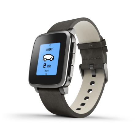
Instead of a touch screen favoured by most smartwatches, the Pebble has just four buttons, that you can use to control almost anything. They are hopeless for data entry (the calculator apps are all but useless) but they are fine and intuitive for getting around the various menus. The Time Steel has voice recognition, that is used in a few apps, but I don’t find it at all accurate and it is weird to talk to a watch, repeating things that it fails to understand over and over. I’m guessing it uses a cloud service to perform the translation itself: a bit bothersome for privacy. I really don’t get the Star Trek notion of talking to your computer. Sure, it’s fine for quick look-ups but I don’t think the evangelists for such things ever looked at how real people actually behave. It’s bad enough having to add things to my shopping list in a supermarket, make appointments on a bus, or take notes in a cafe. Can you imagine dictating a report or a paper in a crowded office or Starbucks? Especially when more than a few people are doing it? Even in the family home it is plain weird to hear someone talking into their computer in the next room and, for many things, confidentiality and privacy are serious issues. So, for a vast number of use cases, the only way to use voice recognition is in a soundproof room. Surprisingly, perhaps, computers that you talk to are considerably more anti-social than those that you write to.
Like most such devices, the Pebble relies on a smartphone for much of its functionality, pulling apps and data (such as GPS coordinates, weather, news, etc) from the phone as needed, keeping only the more recently used ones in its cache. Some apps require separate companion apps on the phone (as opposed to just the Pebble app itself) but, as most eat more battery, I have tried to avoid those where I can. I started by installing a lot of apps but soon realized that most were entirely pointless. On the whole, it is easier to reach into your pocket and use the phone app than to navigate through menus on the watch to find the reduced-functionality one that you need. There are a few that I use all the time: the watch itself, notifications, weather, a shopping list, the alarms, a sailing tracker.
I installed O365 and Evernote note reading apps, but never used them after testing that they worked: it’s basically a terrible way to read notes. I quite liked being able to control presentations from my watch until, the first time I tried to use it for a keynote and despite having tested fine beforehand, it didn’t work at all. A high stress public talk is a bad place to find that out.
As an e-reader, not unexpectedly, the Pebble leaves a lot to be desired. There are various apps that will read text, RSS feeds, etc, by scrolling at a fixed rate, as well as those that let you painfully scroll through text files but one in particular intrigued me: AFR (a faster reader). This displays words one at a time at a configurable speed, laid out in a way that keeps your focus on a central coloured letter (an implementation of RSVP). It’s a strange and disconcerting experience. A standard e-book is bad enough for reducing the contextual information needed to remember what you have read, but AFR decontextualizes every single word, flowing like a video through the text, one word at a time. It cannot read PDFs or DRM’d books (though you can copy your iPhone’s clipboard into it) – and it can be a bit complicated to get text into it, despite useful sharing options in iOS. It also requires a companion app in iOS. It chokes on even mildly complex formatting, and the backlight turns off as usual while it is running so, unless you are in brightly lit conditions, it is not easy to read. There is no control over the text size which, on my watch, is difficult to read even with normal reading glasses. It is also pretty buggy, prone to freezing, and, worst of all, the speed of text on the Pebble does not match that on the iPhone (in fact, it often reads as nonsense, skipping words rather than just slowing down, and showing them at a rate of about one per second, which is hopeless). However, as a concept, I think it is quite neat and well worth exploring further.
As a watch, the Pebble Time Steel is great. I love the backlight. I love that it is waterproof. I can live with charging it once a week. I love the alarms. However, like all computers, it crashes occasionally. Not every week, but maybe every month. Relying on the alarm can, therefore, be a bit risky if it really matters. I’ve experienced one major crash in the past 3 months, which required a device reset. This was annoying, not just for the hassle of having to figure out the weird button combinations needed for the reset, but also because it lost all my settings (including the alarms, that I only realized quite late the next morning). It is also annoying that the app has to be running in the background on the iPhone, and the iPhone doesn’t let you force an app to remain running. The first couple of times it stopped were quite confusing, because the watch told me it couldn’t communicate with the phone, even though I could see it was connected via bluetooth. I just needed to start the app again. I suspect the Android app might be better in that regard though, unfortunately, you cannot pair the watch with more than one device at a time so I’ve not tried that. Though it uses a very lightweight bluetooth connection for most of its activities, it does eat more of my phone battery than I’d like: perhaps 10-20% of its capacity per day. This is a nuisance, but my phone still lasts more than a day on the whole (well, at least it did before Pokémon GO) so it is not too bad.
Overall, I like the Pebble Time Steel. It’s not going to be my e-reader of choice, but it’s a darn good watch. It’s neither ugly nor attractive – the strap is actually very tasteful – it’s comfortable, it tells the time, it withstands bangs and dunkings, it wakes me up, it provides useful information, it doesn’t get in the way, it doesn’t need constant care, it’s always there. But I doubt that I will keep it for very long. In the past, watches used to last for 10 years or more (my Swiss watch is about 20 years old) but I would be quite surprised if this lasts me even a couple of years. Maybe less – its reliance on a proprietary app and phone is quite worrisome and could fail at any time. Such is the way of modern tech. We do not own the things we buy any more.
https://www.pebble.com/buy-pebble-time-steel-smartwatch
iPad Pro
 At first sight the iPad Pro seems like an odd idea. It’s too uncomfortable to hold in one hand, too big to fit in an iPad pocket, it needs a (non-included) pen to operate its smartest features, and it is really expensive, even compared with a quite high-spec laptop. But the ‘Pro’ nomenclature reveals some of what Apple is aiming for: this is not meant as a device for the masses but is instead for those seeking serious productivity from their device, a different way of engaging with a tablet, beyond media consumption, game playing and simple interaction. Indeed, Apple has gone so far as to claim it can be a laptop replacement, if you add a keyboard.
The device feels huge at first, albeit that it is slim and beautiful to hold. After a few hours, though, using a standard iPad feels cramped and small, and the Pro feels quite normal. You’d not want to hold this in one hand for any length of time, of course. It doesn’t actually weigh noticeably more than the first generation iPad, but the force it exerts on your hand can be considerably greater, unless you get the balance exactly right. That’s actually not too hard, though it does call for a change in approach. I tend to use the device on my lap, or propped up in bed, or in its keyboard case resting on a chair or table. I can walk around with it when I need to, and that’s a world away from walking around with a laptop, and it is vastly much easier to share with other people around you. I have found that its extraordinarily good video display makes it a far more interesting social device than smaller tablets when sitting around with other people. I am very used to passing a tablet around for my wife, family and friends to look at but, with the iPad Pro, we can all look at the same thing together, sitting on a sofa or at a table. It’s surprisingly superior to the same experience using a laptop too. Perhaps it is the lack of other intrusions, or the cleanness of just a screen and nothing else to interfere with the experience. The iPad largely disappears, leaving only the content it displays. Those that hold it tend to be reluctant to let go again. The battery life is good: 9 or 10 hours seems about normal.
The Pro is great for reading of news sites, letting you see large amounts of individual articles and links to other articles on a page. Much more convenient than a newspaper, but with a similar capability to show not just what you are reading but other stories around it. Oddly, though, it is not as satisfying as I had thought it might be for normal e-books. In some ways is exacerbates the problem of there being a lot of undifferentiated, non-typeset text, emphasizing the fact that there has been no human involvement in laying it out on screen. However, for books with many diagrams and images, it is a lot better than smaller devices and, for those with particularly bad eyesight, it might be wonderful. For simply reading a long-form linear text, however, the Kindle Voyage wins hands down.
One big hope that I had for this was, like the DPT-S1, to be able to comfortably read – and annotate – PDF files originally designed for print. This has actually worked out pretty well – far, far better than the rotten DPT-S1. Reading is easy on the eye, immune to most light levels apart from really bright sun or spotlights, and the experience is mostly smooth and slick. The size of the screen means that there is even enough space for apps like Goodreader to show previews of surrounding pages, which helps a lot in getting a sense of where you are in a text (a perennial problem with most existing e-readers), and largely eliminates one of the major cognitive hurdles in reading e-texts, that there is no consistent visual pattern to help you remember what you have read. When I have a lot of work to mark, this is great. It is much lighter and easier to carry than (say) a paper thesis or dissertation, and almost as easy to mark up, though nothing like as light as the DPT-S1. One notable difference between paper and all the software I have used, however, is that it is much harder to flick between multiple pages, to hold two or three open at once from different parts of the manuscript to compare and connect them: it would be so useful to find a good way to replicate this, especially for writing my own books and papers. Though bookmarks help, it is nothing like as fluid or easy as holding a manuscript with fingers on each passage that interests me. I suspect that a desk-sized tablet, with the same retina resolution and an Apple Pencil, might solve this problem, with the right software. Though quite a few ‘tablets’ with such dimensions do exist, all of those I have seen cannot come close to this resolution, including the ludicrously priced Microsoft Surface Hub. We might have a generation or two to go before that becomes a reality and, by then, heads-up displays will offer a much more cost-effective and flexible alternative. I think perhaps that the main problem is the metaphor of a screen as being a window into virtual space. Windows frame things that should not be framed.
There are numerous annotation-friendly apps for PDFs available, with different strengths and weaknesses. It bugs me, though, that every app maintains its own storage so you cannot seamlessly flit between different apps to take advantage of their different features. This is one of the things that makes iOS secure, but it makes it very annoying to manage documents, even though cloud storage services can reduce that pain a little. Essentially, though, you have to copy documents between one app and the next, rather than simply working on them with whatever you want to use. There is no sense of connection and continuity. I guess, if I were wise, I would simply use a single moderately good app like Goodreader, with its own storage and copious links to cloud storage for shifting documents around, and leave it at that, but that’s not the kind of guy I am, and it doesn’t handle all document workflows well, especially with regard to conversion between formats. I want to keep chasing the adjacent possible.
I am far from being a visual artist, but there are many occasions that it would be useful to draw things, create diagrams, design 3D objects for printing or VR, sketch ideas, mockup interfaces, sketch over images, and so on. In dedicated apps, with the Apple Pencil, the iPad mostly feels much like working on paper, with all the additional tools, views, perspectives, layers and wonderful extras that the computer-based environment provides. Very different too from working with a graphics tablet that, because it is separate from the created object, has always felt alienating and awkward to me. There are also plenty of tools that let you annotate PDFs and images. But I would like to be able to do this kind of thing and seamlessly incorporate it into anything that I am doing – to sketch in a slideshow, or word processor, a book, a paper, or whatever, wherever I am. The notion that documents are of a particular type – not just text, image, diagram, etc but specific formats of such things (Word, Kindle, PNG, etc) – is deep in the genes of even the smartest tablets. We seem trapped in a 1980s timewarp on this. It is even true of formats that ought to support such flexibility like word processors, perhaps because of Microsoft’s stranglehold on word processing paradigms that has kept us in a typewriter mindset for decades. Even Apple’s own otherwise great Pages is victim to this. At best, you can embed an image or use a separate app within the main application.
After Apple’s hype, I wondered whether it might also work as a laptop replacement, and so I got a backlit Logitech keyboard to test this theory out. I have tried this experiment with various different tablets (Apple, Android, and Windows) over the past 6 years or so, but all my efforts so far had been less than wonderful. Fine for a day or two on the road, but not at all close to the laptop experience. The iPad Pro is better, but still not ideal. I’m typing this on the Logitech keyboard and finding it to be at least as comfortable as typing on my MacBook Pro. The screen is incredibly bright and clear. WIth the enormous Logitech case, though, it is very heavy indeed, perhaps heavier than my MacBook Pro and far less well balanced. The case has only one position – comfortable-ish, but not great. It has a nice set of iPad optimized function keys, though, and works with most Mac keyboard shortcuts, e.g. app switching. I also like that it just works, sipping power from the iPad itself. It is a vast improvement on smaller machines – especially with the dual-window view – and might be OK for a few days at a pinch if I were not doing anything apart from using the Internet, doing a bit of writing, and maybe a bit of presenting. There probably are some people that could use it as a laptop all the time but, as a technologist and computing professional, it is nothing like close enough: the software is simply not sufficiently capable. It’s OK at a pinch for remote-controlling the Macbook Pro, but not a lot of fun. I’m enjoying the new iOS Scrivener app, which is very close to the desktop version in power and usability, but it lacks the tight integration with reference libraries of the desktop version, and I use such things a great deal.
The retina resolution makes a really great second screen that I can use while travelling or on my boat, using the terrific Duet app for a virtually lagless and seamless experience. I have done this with the smaller iPad Air 2 for some time, but it has always been just a little bit of extra real estate, not a seriously useful extra monitor: helpful for, say, viewing incoming email or writing brief notes, but not in the same league as a real second monitor. The iPad Pro can be used for real work – programming, marking, research, etc are a breeze with a big screen attached. Not quite as amazing as my 29” Apple monitor, but good enough for real gains in productivity. Though it has to be tethered to the MacBook Pro for this, it allows you to read papers etc from the much more flexible computer with at least some of the benefits of a tablet.
Another good surprise is the onscreen keyboard, that is not far off complete, with a row of numbers and a good range of punctuation available at all times, and a size that fits my hands well. This only applies to apps that have been optimized for the iPad Pro – there are still quite a few that make use of the more basic and less functional keyboard of the older iPad. In fact, there are even a few iPhone apps that do run on the Pro, albeit not completely full-screen (even with double scaling) which looks entirely weird, like clunky toys. But, when you get the full iPad experience, typing on the screen is far easier and friendlier than in previous models.
One irritation is that quite a few websites decide that I am using an iPad and therefore give me a mobile-optimized – ie. less functional – view. With all that screen real estate it is silly to have a set of buttons etc that are made to work on a cellphone. Conversely, sites that are designed for desktop use can be fiddly, especially when they disable pinch-to-zoom. Google Books (which could be amazingly useful in this format) is a real pain – its tiny zoom buttons are hard to press and it overrides all the usual controls – especially zoom – that one would normally use to deal with that.
Using it in the sunshine is fine, from a screen perspective, but risky: it gets very very hot very very quickly. The first time I realized it was happening I had to rush inside and train a fan on it because the battery was notably in peril. A case is essential for outdoor summer use. It is not great in the rain either.
The Apple Pencil is a real surprise. I was in two minds whether to get it at all. Seriously, $115 for a pencil that doesn’t even write, and that only works with one device (now two)? I could get two cheap tablets for the price of this thin white stick. To make things worse, though it is quite pretty in its simplicity, this is not a well designed tool. The magnetic lid for the lightning connector is guaranteed to be lost, as is the connector that allows it to be charged using a standard lightning cable. I have no idea where I put the spare rubber tip for when the current one wears down. Apple used to be better than this – I am quite sure Steve Jobs would not have allowed this one out of the door. There’s no way to keep it with your iPad, unless you want to 3D print something to hold it or use sticky tape, and neither the Apple nor the Logitech keyboard cases have any means to attach it, which seems bizarre. It is incredibly easy to lose. When just putting it down, the fact that it is magnetic means it will stick to the side of the iPad, but not strongly enough to hold on when it is tilted. It’s not terrible on a flat surface because it is counterweighted a little so that it doesn’t roll too much – a nice design touch. On a white tablecloth, though, it is easily missed. It is just difficult enough to find that it becomes an active decision to use it. It would certainly cure the problems of, say, non-zooming screens in web browsers but, unless it is directly to hand, it is too much hassle to go find it when such needs occur. The fast charge option, though, which gives about 30 minutes use on a 15 second charge, is quite smart, and I love the way it disables the touch sensitive screen when it gets close to it, so you can very comfortably rest your hand and trust that you will not suddenly start drawing with knuckles or other parts of your anatomy.
In most apps (not all), lines appear instantly, with no perceptible lag, a great deal of accuracy (Apple make the point that the level of control is tens of times more accurate than even the best passive pens) and a reassuring amount of tactile feedback. I have used other styluses that are best of breed – Pencil (the non-Apple one), for instance – but they don’t come close enough to replicating the experience of drawing on paper. The Apple Pencil does. Drawing with hard rubber on glass is certainly not at all the same thing as writing on paper with pen, pencil, charcoal or brush, but it’s a lot better than a hard-tipped or blobby rubber-tipped stylus, and it is easy to get used to it, especially thanks to the near-instant feedback. I can create extremely small details, with a similar amount of precision as I would get with a ballpoint ben, though maybe a little less than with a proper drawing pen like a Rapidograph or even a fine rollerball. However, that tends to be no big problem because, in most apps, you can zoom in to any level of detail you like. I was quite surprised to find it really easy and natural to, for instance, draw lines using a real ruler, which (on older tablets) is possible but totally weird, and prone to accidental artefacts. You can even trace or draw around things, which is neat for 3D design, especially. There is, though, still a very slight perceptible distance between the drawing surface and the stylus. The glass is extremely thin indeed – a hair’s breadth – but it is still there, and it separates you from the page. It’s like the difference between playing a guitar and playing a piano: the feedback is between hand and brain rather than hand and medium. It’s not quite direct.
I am enjoying the Apple Pencil more and more. Its precision turns out to be extremely useful at times, allowing manipulations and selection of small objects with ease, and I enjoy writing and sketching with it. It just disappears (sadly, literally sometimes) and it changes the nature of the interaction with the tablet in some very good ways.
Overall, I was not expecting wonders from the iPad Pro – at least compared with the Air 2 – and was totally in sympathy with Steve Jobs’s edict to avoid styluses on such things, but I have been very pleasantly surprised. The size of the iPad Pro makes a huge difference for reading (though seldom of e-books) and working in general, the Pencil is really effective for all its design flaws, and this, after my Macbook Pro and iPhone, is one of my favourite and most-used devices.
http://www.apple.com/ca/shop/buy-ipad/ipad-pro